Kathleen and I are currently collaborating on a post about ordering garment labels. While making notes on all the things you need to know about ordering labels, we ended up discussing several technical terms that needed explanation. I am writing this as a precursor to the label post because I feel that logo/artwork design needs to be discussed first.
Good logo design is something I am passionate about. Having gone through the logo creation process for companies and products worth millions of dollars, where the company spent tens of thousands on a graphic artist, you learn an awful lot about logo design. I’m not talking about artistic merit or quality, I’m talking about practicality.
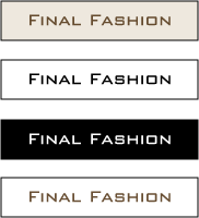
One thing you will notice about the logos that you know well -you know, the Nike swoosh, the AT&T globe, the Coca Cola logo, etc.- is that they are all bold and simple. You won’t find fancy things like photographs, gradients, tons of colors and the like. The logos are simple, they are easily scalable and they look clean in black and white.
A while back, Danielle posted a few logo designs for her hypothetical line. Most designers would shun such a simple label because they go for flash and aesthetic appeal but considering Danielle’s strong artistic background, you can appreciate that she obviously knows something about logo design, namely the challenges of using it.
Having said that we will run down a few tips on good logo design:
1. Your logo/artwork should look good in black and white and color. It should look crisp and clean in black and white. There will often be cases where your logo will not be reproduced in color (for example on faxed letterhead) and the logo should still be distinguishable in a crisp, black and white version.
2. Your logo/artwork should retain it’s visual integrity when scaled up or down. A logo that only looks good at very large or very small sizes is a bad logo.
3. Fine lines should be kept to a minimum, simply because as the logo is scaled down, they become less visible. Also, fine lines are difficult to reproduce on woven labels (and even printed labels in many instances).
4. Keep colors to a minimum. One or two color logos are less expensive to reproduce than full color logos, whether we’re talking about professional printing or labels. If you can, try to incorporate standard Pantone colors because “color matching” special Pantone colors usually results in additional charges. If you care to know the technical reason, it’s because when printing, ink comes in standard Pantone spot and process colors, all other colors are mixed using combinations of the standard ink colors. Thus, when you have to “color match” a Pantone color, the printer has to mix the ink to obtain that color, thus the charge. Additionally, many times thread (for woven labels) has to be dyed to match special Pantone colors.
In addition, when printing your logo (with the exception of digital printing), every color requires a separate “plate” (you will often hear the term “plate charges”). Every color, including black. So if you have a three color logo, you are looking at three plates. Printing plates or screens can cost anywhere from $30-50 and up. This is one reason that if you have a logo with multiple colors, it is advisable to have a black and white or single color version. Trust me, those elaborate logos are adorable, but you will hate set up charges as they can dramatically increase the cost of your printing when you are only printing a small quantity (500-1000 pieces).
5. If your logo is complex, have an alternate version that is simple. I wish I could think of an example of a large company that does this, but nothing comes to mind off hand. Many companies that have a logo that includes both a graphic and text element, will also have a text only version of their logo.
6. Your logo should be in vector file format and if you can’t do that, you need a very high resolution pixel file (but you really, really, really should have a vector file). You can read more about vector files in this wikipedia article.
7. Your logo should be provided in an industry standard file format. This means that those of you creating your logos in Microsoft Word, or a cheap paint program, will usually not have the correct file format, nor the correct file specifications (image size, resolution, colors, etc.). When this happens the company working on your logo usually has to “fix” it and get it in the right format for printing. This usually results in high “artwork” charges. Since many companies don’t get the correct file formats, they end up incurring artwork charges every time they reproduce that logo.
Many people reading this are not learning something new, while some people are saying “oh you mean that clip art logo my friend’s son made for me won’t work?” Many people don’t end up with logo issues in the start up phase, but as they grow and move to professional reproduction (whether for printing or labels), they incur problems.
While every service company usually has an in house graphics department, person, or contracts out graphic work so they can accommodate any client, you are better off fixing your logo issues (if you have them) once, retaining copies of all the files they give you (they will usually provide different file formats upon completion) and eliminating issues associated with logo reproduction.
Now Kathleen and I can continue with the label design and ordering series…
thanks for all of this miracle. i think my logo holds up, i just need to get it in vector file format. it was created in ai.
Hi there,
Adobe Illustrator (AI) is a vector based program, so your logo is fine. For additional versatility, you would just want to have it saved as an eps (post script) file, that way you don’t have to worry about which version of AI it was saved as.
Ah, Miracle, you haven’t seen my other sheets and sheets of totally unsuitable logos that I’ve gone through! But luckily my visual communication instructor gave me much the same kind of good, practical advice you’ve written here.
Now that my line is hanging on a rack in front of me, all 14 finished samples, it feels a lot less hypothetical now…
It should be noted that young companies often spend a disproportionate amount of time & effort into their logo design process.
Resist the urge – your logo isn’t nearly as important as you think it is.
thanks again miracle. i am glad to hear that. i guess it would be beneficial to have a version of my logo in black and white, since now it is only one color (well one color and white)
I wish some of my customers would read this post! You wouldn’t believe the complexity of some of the logos I get. Some of them are impossible to accurately reproduce with embroidery.
How do both of you feel about clothing labels that use lettering only?
I too receive many requests from people wanting to embroider their logo on apparel and find I have to explain that not every logo is suitable for embroidery. First, your artwork has to be digitized using special equipment and software, so it is compatible on embroidery machinery.(DST format) And a logo that is on your letterhead is not always suitable for embroidery.
Miracle, I am not sure about $80.00 plate charge per color for screenprinting. Do you mean a screen charge ? If so, you should not be paying anymore than $25.00 per color.
I am not sure about $80.00 plate charge per color for screenprinting. Do you mean a screen charge ?
Yes, a screen charge for screen printing, and a plate charge for hot stamping or offset printing.
I should separate the two out because screen charges for screenprinting tend to be much less than plate charges for offset printing.
If so, you should not be paying anymore than $25.00 per color.
I disagree with that. I think sometimes when people make statements like that they do not take into account geographic price differences. That would be like saying you should not pay more than $30 an hour for a patternmaker, not considering in some areas a skilled patternmaker will cost much more.
When it comes to printing, many times small companies are printing too small of a quantity to negotiate fees and charges, thus, you very well might pay, for example, $40 per screen to get your items printed at a shop with an excellent reputation for quality, than shop price and possibly end up with problems.
I say this because when I was getting quotes for screenprinting garments, the shops with better reputations had higher prices. Sure I could have done better had I worked with a smaller shop, or a shop further out from the city, but then I would have been dealing with some limitations on the technical (software) side.
Having DE friends that have screenprinted lines, reliability, quality and consistency are huge issues, and I think sometimes DEs are less concerned with nickel and diming prices as they are with being able to have the peace of mind knowing their line is in good hands.
How do both of you feel about clothing labels that use lettering only?
There are many labels that use lettering only. In fact, most of the lines I can think of offhand use lettering only, and that’s probably because I am used to seeing woven labels.
I was looking at something today and was reminded of this post and something else, something on Edward Tufte’s website. It concerned the use of “negative space”. When creating a logo, it is probably worthwhile to think about the area inside the design that would normally be considered background. The example given was the FedEx logo. Check it out: it’s simple, can be rendered in a single color though they normally use two, and may violate one or two of Miracle’s other rules. Of course, FedEx’s concerns are different than a sewn product manufacturer. However, look at the space between the “E” and the “x”: it’s an icon that implies motion, forward, speed, but it’s also very subliminal. Very neat. And very efficient use of the entire surface (for which you must pay whether you use it or not).
Miracle,
I was being kind when I said $25.00 per color(USD)
I have used outside screen printers of all sizes, and these costs I pass along to a DE when doing a job. In Southern Ontario, the costs range from 15.00- $25.00 per screen per color. In print shops
ranging from 20- 12 station automatics (big operation) to small 4 station manual setups. If screen printers are charging a premium because a DE is smaller than some of the bigger guys, they are getting ripped off.
We have 100 heads of Tajima machinery in our operation.We charge roughly 17 cents per thousand stitches. My US clients tell me that is about 35-40 % less than stateside. Are your DE friends getting charged $3.00 for a 2 color hit when screenprinting in addition to inflated set up costs ?
Miracle,
I was being kind when I said $25.00 per color(USD)
I have used outside screen printers of all sizes, and these costs I pass along to a DE when doing a job. In Southern Ontario, the costs range from 15.00- $25.00 per screen per color. In print shops
ranging from 20- 12 station automatics (big operation) to small 4 station manual setups. If screen printers are charging a premium because a DE is smaller than some of the bigger guys, they are getting ripped off. Plain ans simple.
We have 100 heads of Tajima machinery in our operation.We charge roughly 17 cents per thousand stitches. My US clients tell me that is about 35-40 % less than stateside. Are your DE friends getting charged $3.00 for a 2 color hit when screenprinting in addition to inflated set up costs ?
Yes, I also understand that you are in Canada and I don’t think it can be expected that a shop in California (where I am, for example) will have the same price as Canada when their real estate, labor, utility, and governmentally mandated employee related tax costs are higher.
Believe me, I understand your point about lower prices, but I doubt I’d be able to get a San Francisco based contractor to drop their screen charge to $15, because that’s what it costs in Ontario. Now maybe if someone was producing in the middle states, where costs tend to be lower, I could see that being the case, but you’re not making a fair comparison.
If screen printers are charging a premium because a DE is smaller than some of the bigger guys
I think it is fairly common for prices to be based on quantity produced, and I don’t know a print shop, label manufacturer, screenprinting business or sewing contractor that does not charge lower per item fees for higher volume work.
wow! i use fedex for shipping out all of my orders and i can’t believe i never noticed the arrow!!! Thanks Eric. Very cool!
I kind of miss the old vintage labels. They were beautifully woven , often in many colors with images. I collect them. I particularly like the old western shirt labels..and some over the vintage outerwear (coats) are fantastic. Here’s a company who does small runs.
http://www.clothinglabels4u.com/
Miracle,
I wouldn’t expect a San Francisco area contractor to match Toronto prices. But , you must admit, it is huge difference between $80.00 and $15.00 to burn a screen.
We too have the same degree of regulation by 3 levels of government, as well as higher income tax rates, provincial and national, and property taxes that rank us in the top 5 % of municipalities in North America.
CMT rates on average, are slightly higher than those in the Bay area.
The screen set up charge we have discussed here is part of the cost of embellishing a garment. I just dont think DE’s should have to pay highly inflated prices for screen charges. And running charges too.
But , you must admit, it is huge difference between $80.00 and $15.00 to burn a screen.
Yes there is, but that is why I have amended my post, becuase I should not have lumped screen charges in with printing plate charges and that was an error on my behalf. If you’re going to keep contending the $80, it’s moot because that has already been corrected.
I just dont think DE’s should have to pay highly inflated prices for screen charges. And running charges too.
Yes you’re right, but often, what is highly inflated to you is what is common to others. It all depends on what geographic area you are in and what market you are designing for.
Considerations have to be made for differences in product. This happens a lot because apparel is so diverse. While one DE may be developing a line of tees (for example) that will retail for $20-30, another might be developing a line that will retail for $75 (which is common in contemporary apparel). What makes sense for one might not make sense for another.
I believe that no DE wants to pay more than they have to for anything, but considering all the challenges DEs face, there is often a tradeoff a DE will make to have the peace of mind of working with a particular contractor or service provider, and the value of that cannot always be quantified in dollars.
Dear Sir/Madam,
Wanna Know About the desging courses for desgining of woven labels….
How can I get my logo woven into the fabric as a pattern and not screen printed on?
Hello, your blog is very information. It’s great to see sharing of information!
I have a friend who has a silk tie (6 colors striped). He came to me (I’m an artist) and asked if I could find someone to weave the 6 stripe 500yards (min) of 100% cotton to be used for men’s boxers, jacket lining, men’s shirting. He suggested a percale cotton (like bed sheeting). I have contacted a few listed on the cotton inc. website and they all had minimums of 3000yards eeek! Any suggestions or recommendations??
I told him to just get a plain fabric dyed with the stripe on it.
Thanks so much.
I am trying to find a logo designer but so far the prices seem a little steep, what is a practical price for a logo?
A practical price for a logo? It depends. As an art director at a design company, we base our logo design pricing on the final value of the logo. Logos for large companies like Nike have more exposure/brand recognition than a mom and pop organization. Typically, we don’t charge less than $1000 for a logo. As a freelancer (working on the side for friends), I’ve charged $500 or $600.
Anything less, and you probably aren’t going to get a very good logo. Good designers value their work and price it accordingly. You can get a logo designed for $100 on the web, but it’s probably going to break every single rule listed above, and will become problematic when it comes to embroidery, size reduction etc.
Also, contrary to one of the posts above, branding IS important, and a key part of that branding is your logo.
Key mistakes I see from clients are that they want to be literal with their logo. It DOES NOT need to include 14 icons and the kitchen sink. Simple is best, a bigger logo is almost always NOT better, and trust your designer. They went to school for this. They know what they are doing.
Don’t expect them to present 5 finished logo options for you to choose from. A good designer knows what works and what doesn’t. They will narrow down the options for you to either one or maybe two solutions, because a good designer knows what works and what doesn’t. That being said, if you really hate the solution they came up with, let them know, and let them know why you don’t like it. That feedback is what we need to come up with a different direction that will work for you.
I commissioned a logo designer and he came up with designs that had already been used. I checked the U.S. Patent website. Now I am designing my own logo because I lost that trust in any future logo designers.
Correction- The Nike swoosh and the AT&T globe aren’t logos, they are trade marks. The word logo is derived from logotype which implies the use of a font. A trade mark can be part of a logo but a logo has to have words in the design. Also the term “graphic artist” is a bit archaic. We are mostly referred to as “graphic designers” these days.
Many people reading this are not learning something new, while some people are saying “oh you mean that clip art logo my friend’s son made for me won’t work?”
Another point about clip art–even if it’s in vector format–you may be able to use it for non-commercial purposes, but most times you don’t have the right to incorporate it into a logo. I used some poker chips in our logo from 123rf.com, an inexpensive photo and illustration source. When I went back and checked, there it was, the clause that says I couldn’t use it in a logo. I had the art redone by a professional illustrator.
You might think you could fly under the radar on this, but it’s not worth it. Even if you are small, you may be big one day, and vulnerable to legal action.
Redone, meaning redesigned to be slightly different than the clip art version to avoid copyright infringement.